Issue #03 - Harlquinade
Scans and Review by Jim Harvey
 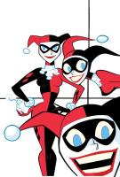   
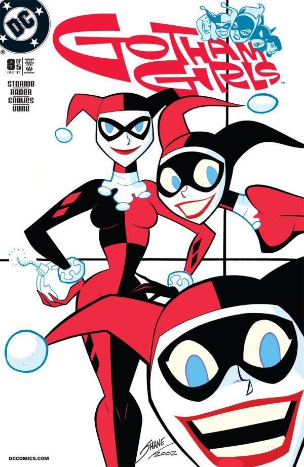
Gotham Girls #3
Cover Date - December 2002
Written by Paul Storrie; art by Jennifer Graves and J. Bone; cover by
Shane Glines
Harley Quinn gets control of a chemical formula everyone wants, which
means that nothing goes as planned — not even for her best pal Poison
Ivy. And Detective Reneé Montoya is hot on everyone’s trail…
Review
The writing on this series remains true to the characters. Every
character here is exactly how they should be, especially Harley
Quinn - the focus of the issue. You just gotta love that opening
page! Storrie brings up something that many people seem to
forget. While Harley may be insane, she's not stupid. I think
some past stories have forgotten this, and portrayed her as a
complete idiot. Granted, she may act that way sometimes, but she
is not an idiot. She's not brilliant by any means, but she's not
stupid, either. I also enjoyed the reference back to 'Mad Love.'
I'm surprised at how similar the artwork in this book matches
that of the art in the classic one shot. It makes the flashbacks
flow much easier.
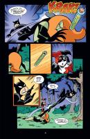
And as usual, the rest of the characters stay perfectly in
character. The character I'm enjoying the most in this series
(until issue #4 that is) is Catwoman. I just really love her
character and Storrie is doing such a great job with her. She's
a backstabber who uses whoever she can to achieve a goal, and we
see that quite a few times in this issue. Hell, I think she's
the first person to sucker punch Batgirl and knock her out. That
scene just personified Catwoman for me in this issue. Just lays
her to waste in those panels so she can keep going. She's done
with Batgirl so...well..WHOK!
But this issue is more about Harley, so let's look into her for
a bit. I just can't help but wonder what's really an act, and
when is she being serious. In the 'House of Mirrors' sequence,
she expects the store to be a real house of mirrors, and then
after that the '7 years' bad luck tale. I'm just curious on
whether or not she's serious there. Is she that superstitious.
Surely she'd not really believe a silly thing like that so she
has to be kidding (Heck, Catwoman mentions it). That, I think,
adds to her character. When is she being serious? When is she
just playing?
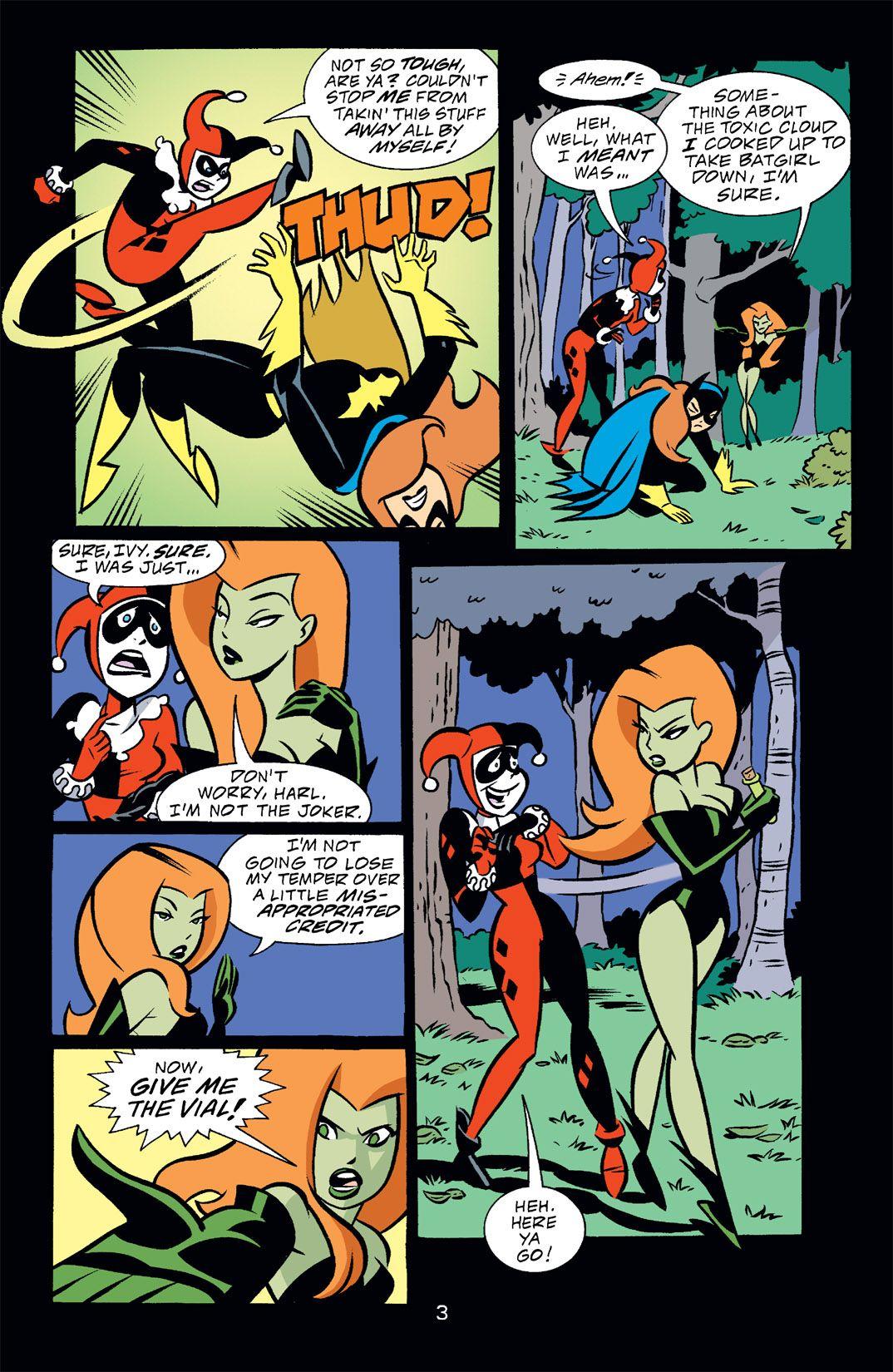
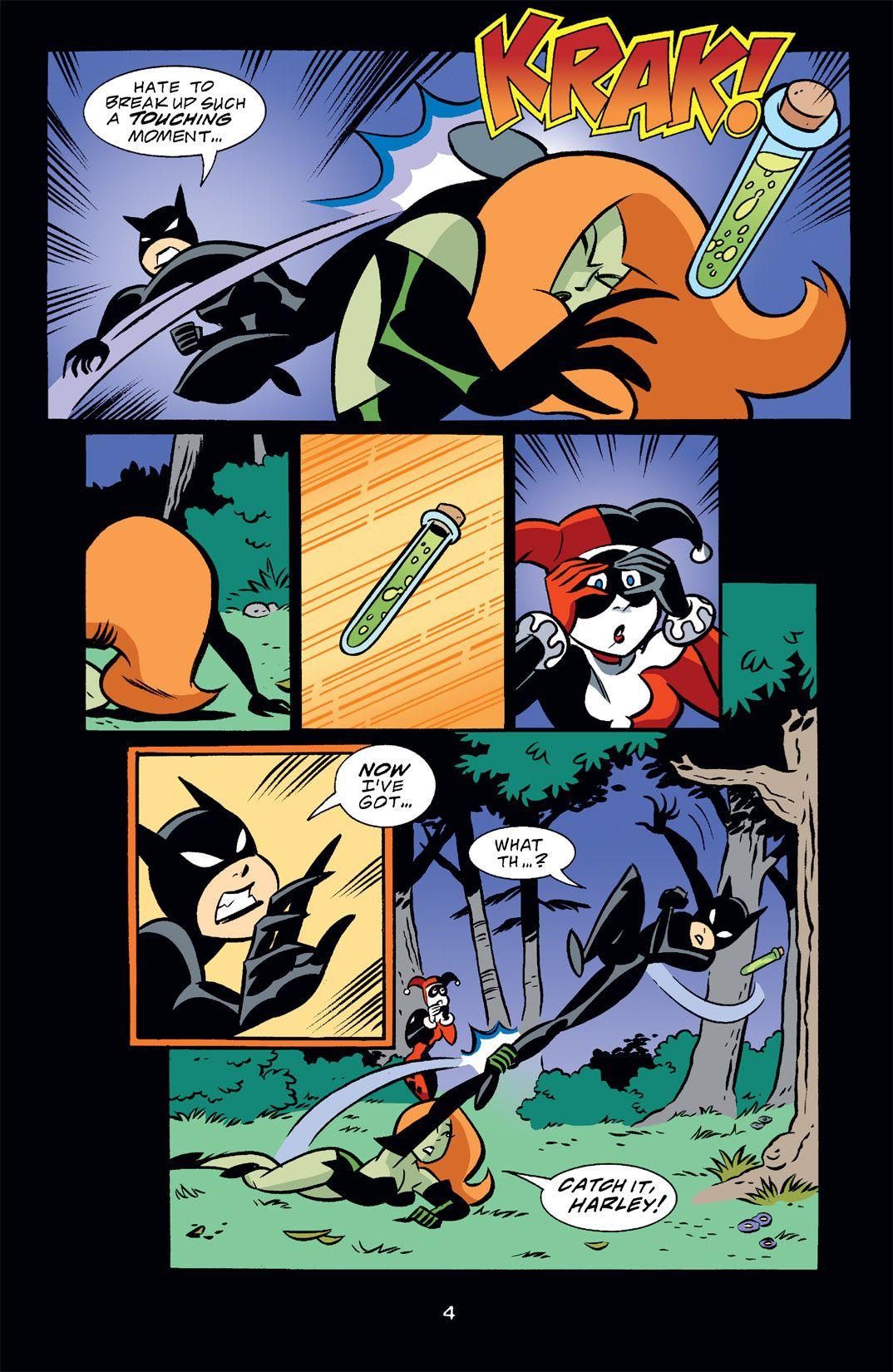
That scene is quickly followed by one which shows her 'little
devil' side by switching the vial for on of her little weapons -
and nicely done, too. This is the second or third time this has
happened in the series so far, right? Is this a kind of running
gag?
Getting back to the 'playing/serious' thing, the 'Harlequinade'
was a nice nod to her character. Like I said earlier, people
tend to classify her as a bumbling idiot when she's actually
pretty smart. Granted the scene is sort of played for laughs,
but it's a nice little bit for her character.
"I AIN'T STUPID!" has got to be one of the most hilarious lines
this character has ever said. Just the contradiction in the
sentence itself adds to the hilarity of the scene. The elongated
flashback to the events of 'Mad Love' at the end are also a nice
choice. I don't know why a few people seem to have a problem
with this. It's helping to flesh out her character more for the
mini-series and it works nicely. It's adding contest to a
simple, quick story. A mad-cap chase after a vial can't fill up
a five issues (unless your Chris Claremont) so this look into
the characters background is required. It just helps to reader
understand each character and their position.
Plus this also builds upon her relationship with Ivy, which is
also a bit of an abusive relationship. Not the same as the
Joker, but abusive nonetheless. Sadly, it's probably the best
relationship she'll ever have.
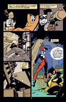
And the art...dear god...how great is this art? Granted, not as
great as the previous two issues, but it's still some great
stuff to look at. Some of the art looks like it's from a frame
of the cartoon series. The first page is a great shot of Harley.
I think that image is so dead on...looks great. Plus, it's dead
on for Harley. The art in the series so far seems like
storyboard artwork. Not the flimsy kind where it's a few lines
scratched her or there, but fully produced artwork, that
includes detail. It just flows nicely.
And ya can't beat the coloring. Patricia is up there with Lee
Loughridge as one of the best colorists to grace the animated
comics. Maybe we'll see some of Patrciai's work on Justice
League Adventures soon - a series solely in need of some better
coloring. The lettering is also a nice compliment. I'm still a
bit disappointed that Tim Harkins isn't doing the series, but
Felix is a nice step in.
[ Back to Guide ]
|