|
The World's Finest Presents
MAIN • CHARACTERS • GUIDES • MEDIA • REVIEWS • BACKSTAGE • RELEASES • DISCUSSION
BACKSTAGE - INTERVIEWS
No stranger to the "animated comics" line of DC Comics, now dubbed
Johnny DC, Christopher Jones has become a recognized name in the
industry. The current artist for The Batman Strikes!, the comic based on the hit
series The Batman, Jones returns in this Q & A session which goes even
further in-depth into the process behind drawing The Batman Strikes!.
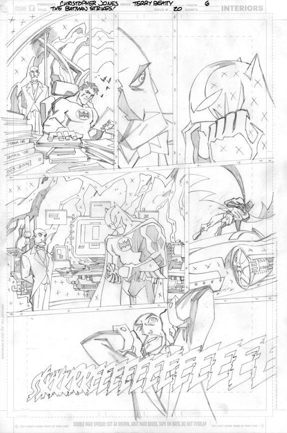
 The World's Finest: The Batman Strikes! #20 spotlights Bane, a
character you've mentioned you're quite fond of. What do you find
appealing about the character (design, backstory, etc)? The World's Finest: The Batman Strikes! #20 spotlights Bane, a
character you've mentioned you're quite fond of. What do you find
appealing about the character (design, backstory, etc)?
Christopher Jones:I think the costume design for the character is quite clever, his outfit
essentially being made up of bands are joined when he's at normal size, and
then separate when he bulks up to accommodate his expanding size. The other
thing about drawing Bane is that a lot of the scripts I've gotten with other
villains tend to have lots of henchmen, huge flocks of birds, or in the case
of the Gearhead story I just drew, really elaborate car chases. My favorite
thing to draw tends to be bodies in action, so the mano-a-mano kind of
action you tend to get in a Bane story is just a lot of fun for me as an
artist.
Does having an affinity for the character make it easier when you put
pencil to paper?
I suppose so. I don't know whether it's technically easier, but it makes the
work more enjoyable, certainly.
It's no secret that during our conversations, I always mention how you
draw Batman's cape. As odd of a question as this may be, take us through how
you approach The Batman's cape, cowl, the whole deal. How do you put you
own touch on Matsuda's Dark Knight design?
When I started working on the book I was really a slave to the model sheets.
Matsuda's models for Batman have really clear guidelines on how to treat
Batman's cape - it tends to hang in straight lines and it wraps around
objects like wet paper. But as I've continued on the book I've strayed from
that a bit, both because of trying to find what works best in static comic
book panels versus animation, and also so I don't just keep repeating the
same shots after twenty issues and counting. As much as I tell artists
starting out not to look to other comics for drawing inspiration, I have
looked at a lot of my favorite Batman artists to see how they've handled The
Cape(TM). Neal Adams, Marshall Rogers, and Jim Aparo have been particularly
inspirational.
 Are there any The Batman designs in particular that you find difficult to
translate, or ones you think could be better? Are there any The Batman designs in particular that you find difficult to
translate, or ones you think could be better?
I don't want to second-guess the designers on the show. They've been in the
difficult position of trying to follow an animated version of Batman that
was right down the center of the strike zone in terms of fan-pleasing
interpretations of the characters, and in addition to pleasing their own
tastes I'm sure Matsuda and company have had to design their characters with
an eye towards providing some contrast with those versions, for creative,
marketing and merchandizing purposes. I think most of the time they've been
very successful. I particularly love the designs for Batman himself, Mr.
Freeze, Man-Bat, and Clayface.
It took me a while to get used to Catwoman's large ears, but now that I've
drawn her in a couple of stories, they don't look odd to me any more. They
are actually more in proportion to her head with most cat ears than what you
typically see in the comics, but I think most fans are used to Catwoman and
Batman costume designs where the ears are more like little horns than
anything actually resembling anatomical ears and it's a bit of a shock when
you first see it.
The Penguin is a little challenging to draw because his proportions are so
stubby. His arms and legs don't seem to have joints. I don't know how they
animate him to be as acrobatic as they do.
Solomon Grundy was really fun for me to draw, but it didn't feel like THE
Solomon Grundy, just because I think of Solomon as being much bulkier and
stockier. But the design is a great one, and that was probably the issue
I've most enjoyed drawing.
Concerning working on a monthly title, are there mistakes you catch
yourself doing when drawing particular characters and try to rectify the
next time the character appears? Is this sort of an ongoing process?
I don't know if I catch "mistakes" per say. I know when I draw a "villain of
the month" for the first time I usually feel like I'm getting the hang of
them right when I'm running out of pages, so it's always nice when they
return so I can try and do more with them. There's a progression of just
trying to get the character to look like the model sheets at first, and then
really making them your own and giving them some life. I think I did both
The Penguin and The Joker much better in their return appearances than when
I first drew them in the book. I'm just starting on a Man-Bat story that
marks the first time I've drawn that character since issue #2, which I drew
before seeing the show and when I only two different drawings to base the
look of the character on. I really hope to do better with him this time.
Having worked on nearly twenty issues, as of Issue #20's release date
(there were two fill-in issues), have you noticed a significant change in
your style and approach on this comic?
I've just finished my 20th issue actually (#22) and am starting on #23.
That's 400 pages of The Batman Strikes! for me. Whew!
I think I've gotten better. I think I'm less aping Jeff Matsuda and more
drawing the TV show's character designs but drawing the book in a style of
my own.
 In issue #18, we were presented with the The Batman Strikes! introduction
to Batgirl, who's noticeably younger than her previous animated incarnation.
Comics are notorious for having 16 year old girls look like 30 year old
over-stacked body-builders. How do you make sure that a character as young
as Batgirl, around the age of 15 or 16, looks her age? In issue #18, we were presented with the The Batman Strikes! introduction
to Batgirl, who's noticeably younger than her previous animated incarnation.
Comics are notorious for having 16 year old girls look like 30 year old
over-stacked body-builders. How do you make sure that a character as young
as Batgirl, around the age of 15 or 16, looks her age?
Well the character came pre-designed so I didn't have to worry about that
too much. The main things to look out for is to not add too many lines to
the face, to not let the drawing get too angular, and to keep the head large
and the body thin and petite. That seems to denote youth in this style.
Batgirl's been a lot of tun to draw, and it's great using her as a way to
involve Gordon more in the story. I've always loved Commissioner Gordon as a
character, and the Gordon design from the show is actually one of their more
"traditional" character interpretations.
Issue #19 featured a splash page with Solomon Grundy. Looking closer,
there was an extraordinary amount of detail added. You added frogs and small
miscellaneous details to the entire swamp bog. When doing a splash page such
as this, do you find yourself approaching it differently as you would a
regular panel? Do you add detail that normally wouldn't be seen in The
Batman comic?
I hadn't gotten a lot of opportunities to do full page shots in this book,
and when I had the opportunity to do one that was a reveal of Solomon Grundy
emerging from the swamp, I just had to go to town on it. I don't know if
there was that much more detail on that page then there would be on any
other page, it's just not usually all a single image. Also, the fact that it
was the swamp rather than a more common Gotham City setting allowed me to
approach the scene a little differently than how I would normally draw
Gotham in this book. Terry Beatty did a great job inking that page and it
just turned out beautifully!
 Now, tell us why we should all buy The Batman Strikes! #20 when it hits?
Will we see some more Gordon/Thorne drama? Some Thorne/Bane tussles? Please
Chris - sell us on this issue! Now, tell us why we should all buy The Batman Strikes! #20 when it hits?
Will we see some more Gordon/Thorne drama? Some Thorne/Bane tussles? Please
Chris - sell us on this issue!
Thorne is back and causing trouble again. We continue to see that while the
Rogue's Gallery villains are flashy and loud and get all the attention from
Batman and the police, behind the scene's Rupert Thorne seems to have his
fingers in just about everything crooked in Gotham City. This time it's
gambling and fixing boxing matches, and he kidnaps the family of an
up-and-coming prizefighter to force him to throw the championship fight.
Batman tries to intervene and finds himself face-to-face with Thorne's hired
muscle: Bane. So there's a fight inside and another fight outside of the
ring in this one. It's a great script and a slightly more serious drama than
a lot of issues of Batman Strikes we've seen. The script is by Jai Nitz,
who's something of an up-and-comer himself. He did a great job and I'd be
happy to work with him again.
And finally, with Robin scheduled to appear in The Batman and The Batman Strikes! (#26)
later this year, have you started sketching this new version of the
Boy Wonder? Are there any surprises in store for fans of the series with the
introduction - at least in the comic - of this legendary character?
They're really going to be surprised when they learn that this version of
R.O.B.I.N. is a ROBOT!
No, I'm just kidding. There's no sketching for me to do on this one until
they get me the model sheets for the TV show design and he shows up in a
script. I'm really looking forward to it though. I've drawn Batman before
in Justice League Adventures and some other JLA-related stories I did a few
years ago, but I haven't yet drawn the boy wonder professionally.
Seriously, he won't be a robot.
The World's Finest would like to thank Christopher Jones for his
participation in this Q & A. To check out more of the pages that
Christopher Jones provided, check out our Backstage. Past works include Justice League
Adventures, Young Heroes In Love, Kolchak, and a host
of DC specials.To find out more about Christopher Jones, please
visit his official website.
[Back to Backstage]
Check out much more at The World's Finest.
The Batman and all characters and related indicia are (c) and TM of their respective owners.
Original content, copyright The World's Finest. Contact us.
Follow The World's Finest on
Twitter - Facebook - YouTube
|