|
The World's Finest Presents 
THE WORLD'S FINEST MAIN PAGE · SITE SPECIALS · EDITORIALS · FORUM
Rebooting Gotham: The Possible Return of Batman: The Animated Series, Part 2
By Joseph Davis
In my previous essay, I discussed how the return of Batman: The Animated Series (BTAS), which could potentially happen on HBO Max, may be a good thing. With that in mind, I move on to my next thought exercise, which is what that new series might look like. Before I begin, let me say here that I have no advanced knowledge as to whether this reboot will happen and, if it does, what form it may take. This is merely speculation and, yes, some wish fulfillment on my part. Still, those of you who read The Justice League Watchtower may remember that I have an eye for this kind of thing and - who knows? - maybe one or two of these ideas may make it into the next Series Bible...assuming it's written.
Of course, a reboot of BTAS would obviously not be a simple return to title cards, rotary phones, and the other trappings of the original series. The show must also be a continuation of The New Batman Adventures, Superman: The Animated Series, Batman Beyond, Justice League, and Justice League Unlimited, as each series is - in its own way - a vital part of our Batman's journey. To dismiss it is to discard vital steps of this character's evolution. To be true to the character of the past 30 years, our potential series must be a reboot of the DCAU as a whole.
That is not to say, however, that our new series would be DC Universe Presents. Batman would remain our focus, and Gotham City would remain the primary setting. Sure, he could still jet around the world on missions and into space and other dimensions with the Justice League (and one would assume that would happen off-camera), but the main focus of the show should be Batman's war on crime in his native city (obviously not a hard rule, of course, as good stories should be pursued no matter what). And while his fellow League members may drop in from time to time for team-ups, the series would not be The Brave and The Bold, Part II. The exception to this rule would be Batgirl, for reasons that we will explore later. Ideally, this show would be Batman's continuing solo adventures, set maybe a year or so after the events of JLU's "Alive!" and "Destroyer."
Premise aside, now we must consider the presentation of the show, of which the first major concern would be visual design. The original BTAS was notable for its hand-painted cels and the "dark deco" look pioneered by Eric Radomski where, rather than using white paper, the art team painted the backgrounds on black paper. This gave the original series a distinctive look and successfully exaggerated the nightmarish tone of Gotham City. However, when the series was originally rebooted in the mid-1990s as The New Batman Adventures, the art team reverted to using white paper, perhaps to better match stylistically with sister show Superman: The Animated Series (and to save money, as they could reuse backgrounds and stock characters).
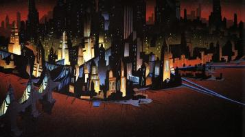 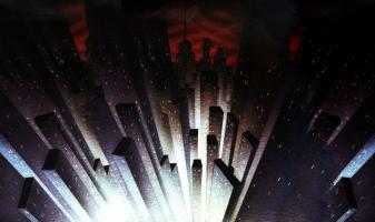 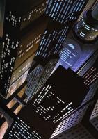
Now, a return to the original hand-drawn animation cels may be a pipe dream, but I think going back to the series' original "dark deco" look would be a smart choice. Of course, with digital animation, it wouldn't be true "dark deco," but surely there must be ways to incorporate the design theory from the original show into its reboot. There would be multiple benefits, the first of which being a stronger tie to the original BTAS series. Also, the darker presentation could also match the potential darker storytelling of a series freed from the shackles of Fox Kids and Kids' WB! restrictions. As for scenes outside of Gotham City, perhaps they could retain the familiar look of Justice League Unlimited et al. That would allow for Batman's stomping grounds to really stand out.
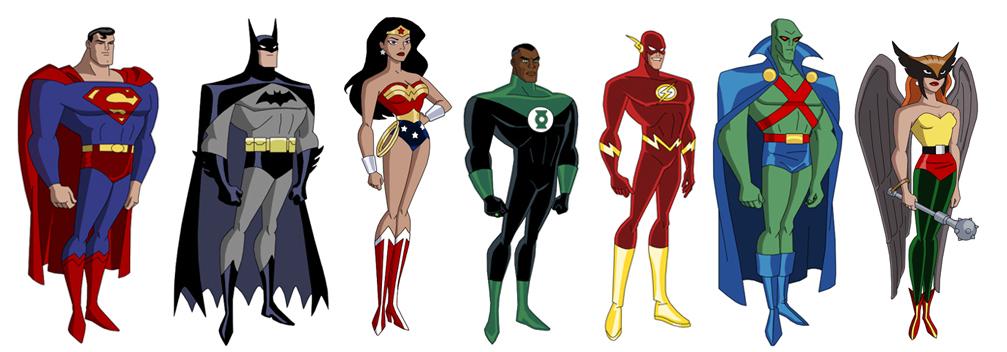
Another benefit to darkening the visuals of the show would be to, paradoxically, brighten up the supporting cast, specifically when it comes to the Dark Knight's famed Rogues Gallery. One of the benefits of "dark deco" was that, with the backgrounds darker, it allowed Gotham's criminal elite to be brighter, more colorful. Now, I do not claim to be an art expert, but I do watch a lot of animated shows, and one thing I've noticed is how art teams take great care to not have the main cast colored in the same way. For example, let's take a look at the cast of the original Justice League:

As you can see above, each character stands out due to their distinctive colors. Together they resemble a rainbow: Superman and Wonder Woman are red and blue with yellow highlights, Batman is black and purple, Green Lantern's is black and green, the Flash is red and yellow, J'onn J'onzz is green and blue with red and yellow highlights, and Hawkgirl is green, yellow, red, and orange (and, in Justice League Unlimited, Shayera Hol was eventually yellow and orange). No two characters have the exact same color scheme, which helps them remain visually distinct from each other.
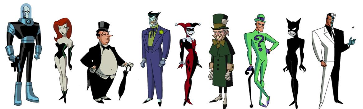
Along the same lines, here is a sampling of BTAS villain designs, courtesy of the limited edition "Villains of Gotham City" I and II sericels sold through Warner Bros. in the 1990s:
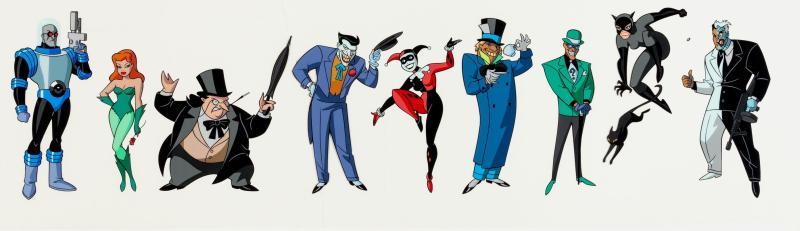
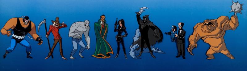
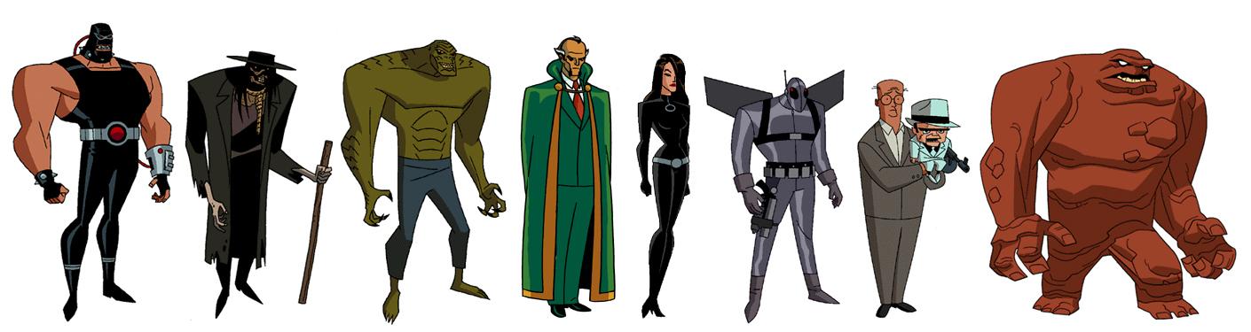
Just like with the Justice League, each rogue has a distinctive costume that helps them stand out from the others. Whether it's the Mad Hatter's royal blue coat, Killer Croc's gray reptilian skin, or the Riddler's lime green sports jacket with matching shoes, it would be hard to confuse these characters in a police line-up. On the other hand, let's take a look at the same characters, but through the lens of TNBA (please note that Firefly has been substituted here for Phantasm, as she never appeared on the sequel series):
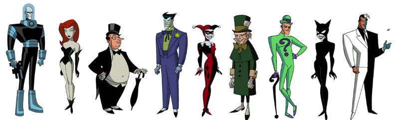
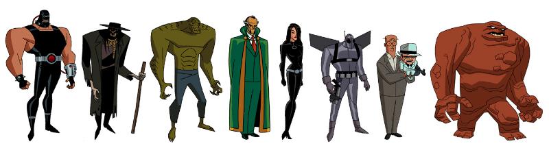
I would argue that, with the conversion to The New Batman Adventures, where the creative team redesigned the cast to be more compatible with Superman: The Animated Series, they overcompensated by making the costumes darker and their color palettes simpler. As a result, too many characters have become reliant on similar shades of green, black, brown, and gray. And while fans can debate the merits and detriments of the redesign choices (I love the Penguin's return to his Golden Age visuals, for example, and I prefer the Joker's royal purple tuxedo here, compared to his almost pink suit on BTAS), I think that, overall, something got lost in the transition.
Some of these redesign choices may have had to do with the tonal shift from BTAS to TNBA. Where many episodes of BTAS sought to highlight the humanity of the villains to illicit sympathy from the audience ("Feats of Clay," "Mad as a Hatter," and "Birds of a Feather," for example), the Kids' WB! show primarily used them in the more traditional "supervillain of the week" style. By darkening their color palettes and designing them to look creepier and more inhuman, the creative team was stripping them of their empathy in preparation for the more formulaic villainy of TNBA. Whereas BTAS featured mostly people who made bad choices, TNBA only had monsters.
One would hope that, in this supposed reboot of BTAS, we may see a return to the deeper storytelling of the original series, with its appreciation for the nuance and motivations of Gotham's costumed criminals. And, if that means a splash of color to differentiate the Mad Hatter from the similarly green Riddler, Killer Croc, and Ra's Al Ghul, well, the more the better.
Click here to discuss this editorial!
Want more? Read "Part 1" right here!
Joseph Davis is a regular contributor to the community, having run the Justice League Watchtower website and posting on WF forums under the name "Karkull."
Follow The World's Finest on
YouTube - Twitter - Facebook
 |